- Give us a call, we do it all! 912-921-5115

ADA Signage
There are a number of general rules for signage:
All signs (except for reflective parking and other traffic signs) must have non-glare backgrounds and characters. Glare and reflection are a major problem for persons with vision impairments, and particularly for the elderly.
All signs that contain visual characters must have a high dark to light (or vice versa) contrast between characters and their background. The important issue is not color, but lightness and darkness: a sign with very light gray letters on a charcoal gray background would be acceptable, but a sign with red letters on a black background would not.
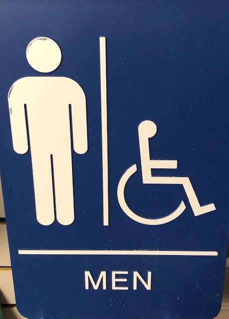
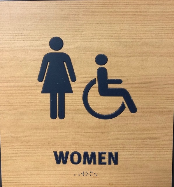
All signs must have "easy to read" typefaces. There are different rules for signs that identify rooms and spaces, versus signs that direct and inform. This is because persons who are "functionally blind" (have no usable vision) are able to locate doors, and therefore can locate signs adjacent to doors that identify them; but have no consistent way to find directional and information signs that could be located anywhere along corridors. Directional and informational signs can use upper and lower case letters (recommended by many experts for visual readability) and "simple" serif typefaces of a non-decorative nature. Condensed or extended typefaces are not allowed. Strokes are of medium weight, not too bold or too thin. The size of the letters is dictated by the distance of the sign from the expected position of the sign reader. Character size on these signs is to be determined by a chart in the 2010 ADA Standards for Accessible Design that uses a combination of the height of the text above the floor and the distance the reader has to stand from the sign. ADA signs that identify rooms and spaces are to be located adjacent to the door they identify so they can be located by persons who are functionally blind. For the most part, one sign is used by both tactile and visual readers, so there are compromises to assist tactile readers. However, it is possible to use two separate signs with the same information. Tactile signs require uppercase characters in sans-serif typefaces. (Helvetica is most common; however other sans-serif typefaces can be used.) The characters can be between 5/8 inch and 2 inches high. The Braille must accompany the characters (below the characters) and must be Contracted Braille (formerly called Grade 2 Braille). The signs are installed 48 inches minimum from the baseline of the lowest raised character and 60 inches maximum from the baseline of the highest raised character. (Although the definition of "character" doesn't include Braille cells, the Access Board has stated that the 48 inch rule applies to the base of the lowest line of Braille cells.) If pictograms are used to identify the space (for example, restroom signs with gender pictograms), they must be in a six inch high clear field and accompanied by a tactile character and Braille label below the field. There are four symbols that stand for accessibility. One is the familiar International Symbol of Access, or "wheelchair symbol." This is used generally to show that persons with mobility impairments can access entrances, restrooms, or pathways. Three are specifically for persons with hearing impairments: the "ear" symbol is the International Symbol of Access for Hearing Loss, and is used to show the availability of an assistive listening system. The "keyboard" symbol stands for a TTY or text telephone. The "phone" symbol with sound waves stands for the availability of a volume controlled phone.